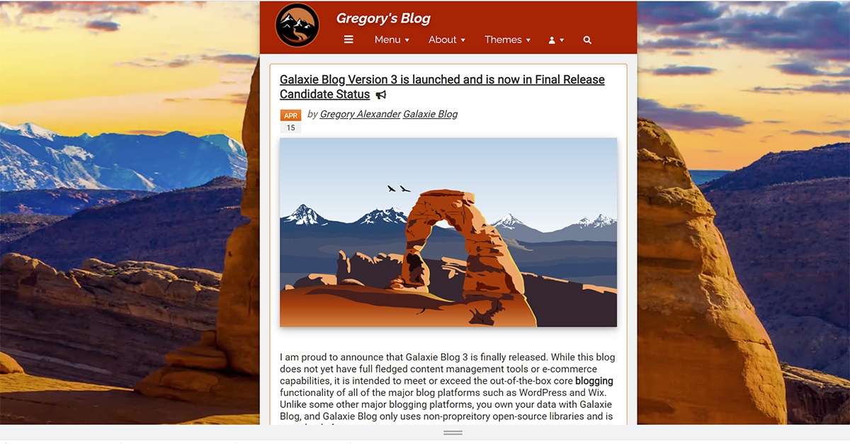
Galaxie Blog Theme Interface
|
May 29 |
When I started building Galaxie Blog, my goal was to create the most beautiful and themeable blog software for the ColdFusion community. In Galaxie Blog version 1, there were a dozen themes, and nearly every aspect of the blog takes on the characteristics of your chosen theme. In Galaxie Blog 3, we have continued and expanded on this tradition.
Galaxie Blog now has around 30 prebuilt themes. I have spent a lot of time ensuring that nearly every widget matches the selected theme. For example, if you upload a video, the primary color of the play button will match your theme. Even a dynamic map route will match the primary color of your theme. You can also construct a post with the theme in mind and upload an image that matches your background theme.
You can have as many themes as you want or design a single theme, but it is best to start out with an existing theme. Every theme is easily changed using WYSIWYG interfaces. The theme settings allow you to change the site's appearance. For example, you can change the icons, backgrounds, fonts, and even how the columns are generated. There are nearly 40 different theme settings, and these settings have a dramatic impact on the site's appearance.
All themes can be viewed by clicking on the Themes dropdown at the top of the page. Every theme takes on specific characteristics found in base Kendo Themes.
Understanding the Kendo Core Less-Based Themes
If you already know the Galaxie Blog theme you want to start with, you don't have to read this part of the article. However, understanding the Kendo Theme is important when theming, so you may want to skim this section at least.
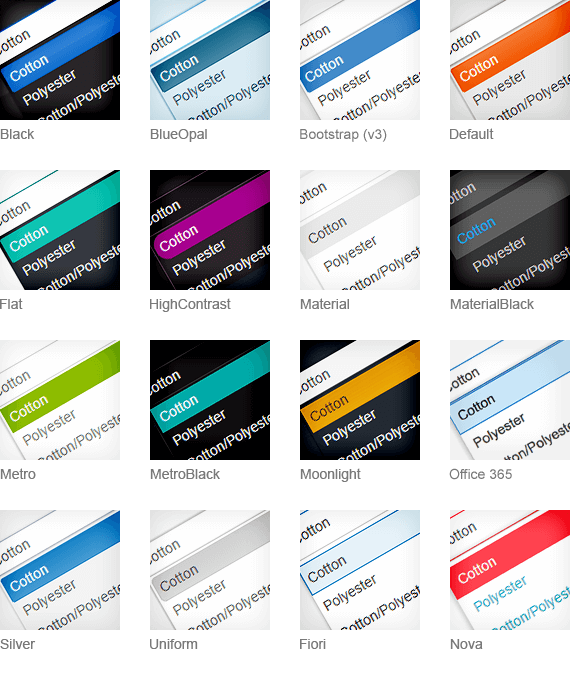
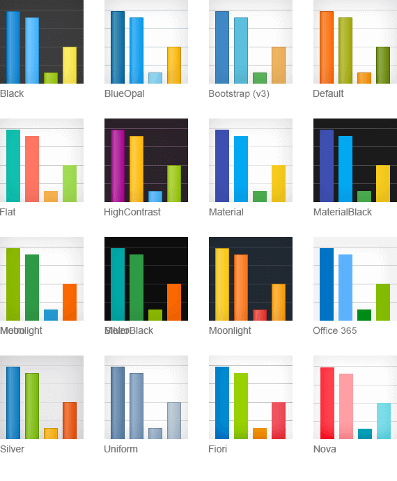
The open-source Kendo Core package that we are using is shipped with 11 different Less-based themes. I have personally incorporated a few more.
Telerik, the company that provides the open-sourced version of Kendo Core, is moving away from using .less-based themes and transitioning towards SASS-based themes still not supported by Kendo Core. I will keep abreast of the new developments and will migrate the Galaxie Blog to the new SASS-based themes if and when there is official Telerik open-source support. For detailed official information on the .less-based themes, please read the Telerik documentation at https://docs.telerik.com/kendo-ui/styles-and-layout/appearance-styling.
I have dissected each Kendo Less theme and developed ColdFusion-based tools to modify its properties. In the future, I will write more articles on integrating other interfaces using the look and feel of the default .less-based Kendo Core themes.
Below are some appearance screenshots of the different Kendo .less themes. Compare these images when looking at the Galaxie Blog themes to understand the Kendo theme's appearance. You can also sort the Theme grid by the kendo Theme in Galaxie Blogs Administrative site to determine each theme's underlying Kendo theme.
Editing an existing Theme
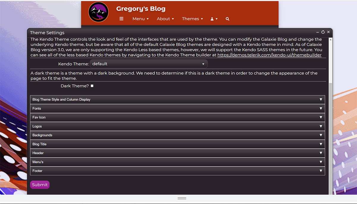
Scores of settings can be independently applied to each theme. These settings are applied using the theme interface, which is divided into nine sections that organize the different theme settings.
Feel free to be curious and investigate by changing these settings- if you make a mistake, you can always revert and restore the default settings.
Main Theme Settings
- Theme Name
You can select your theme name when creating a new theme or override an existing theme. - Use Theme
The default setting is true for every theme. When this checkbox is checked, the theme will appear in the Themes dropdown at the top of the page and be available to be assigned to a particular post. - Select Theme
When this checkbox is checked, the current theme will be the default Galaxie Blog theme, and the theme menu at the top of the page will disappear. However, any themes with the use theme checkbox will still be available to assign to a particular post. - Kendo Theme
The Kendo Theme controls the look and feel of the interfaces used by the Galaxie theme. You can modify the Galaxie Blog and change the underlying Kendo theme, but be aware that all default Galaxie Blog themes are designed with a Kendo theme in mind. See the Kendo Theme section above for more information. - Dark Theme
This setting changes the theme's appearance to handle dark backgrounds. If this theme uses a dark background, check this setting.
Blog Theme Style and Column Display
These theme settings determine the column layout of the blog.
- Main Content Width
This setting requires some elaboration.The main content width sets the width of the main container. This setting will either increase or decrease the blog content depending upon your setting.
The main content width will dynamically adjust to the client's screen resolution. When the monitor is quite wide, it will be set to a lower percentage; conversely, when the monitor is smaller, it will be automatically adjusted to take up more screen real estate.
This is done because you want similar content width across various monitor sizes. The baseline content width that you set will be targeted at a screen resolution between 1700 and 1920 pixels wide.
You should set the main container width to at least 45% when using the modern theme style or 66% when using the classic style, as you will have extra content on the right side. Setting it larger will stretch the main container across the page, making the blog content more cumbersome to read. Generally speaking, the main blog content should be no more than 140 characters wide and focus on the center of the page.
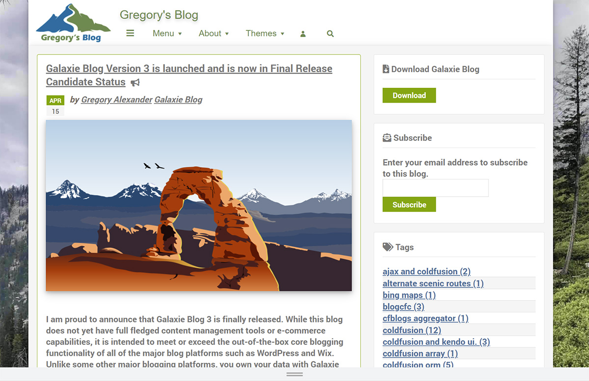
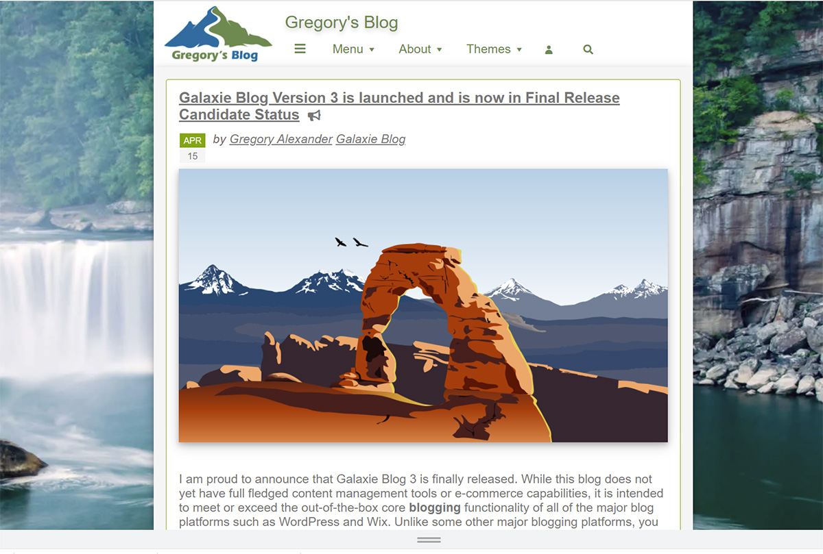
- Blog Theme Style
Your choice here will dramatically affect the blog display.
The Classic theme style displays the column on the right of the blog containing various information pods, such as the categories, recent posts, comments, etc. This layout may appear dated but can be helpful if you want to include visible advertising on the right side of the page.
The Modern theme style eliminates the visible panel; however, this information is still accessible by clicking on the hamburger at the top of the site. The Modern theme style is attractive and keeps the blog content center stage.
- Site Opacity
Site Opacity allows the blog background image to be faintly shown behind the containers on the page. On some themes, I set the opacity level around 93% so that users could see a hint of the background image. For a cleaner look, especially on flat designs, you should set the opacity to 99% to eliminate background image ghosting.
Theme Fonts
Galaxie Blog has hundreds of pre-installed fonts. However, if you need to support a different font set, upload new fonts using the Font Interface. The font will be previewed in the dropdowns when selecting a font so that you can see what you're selecting.
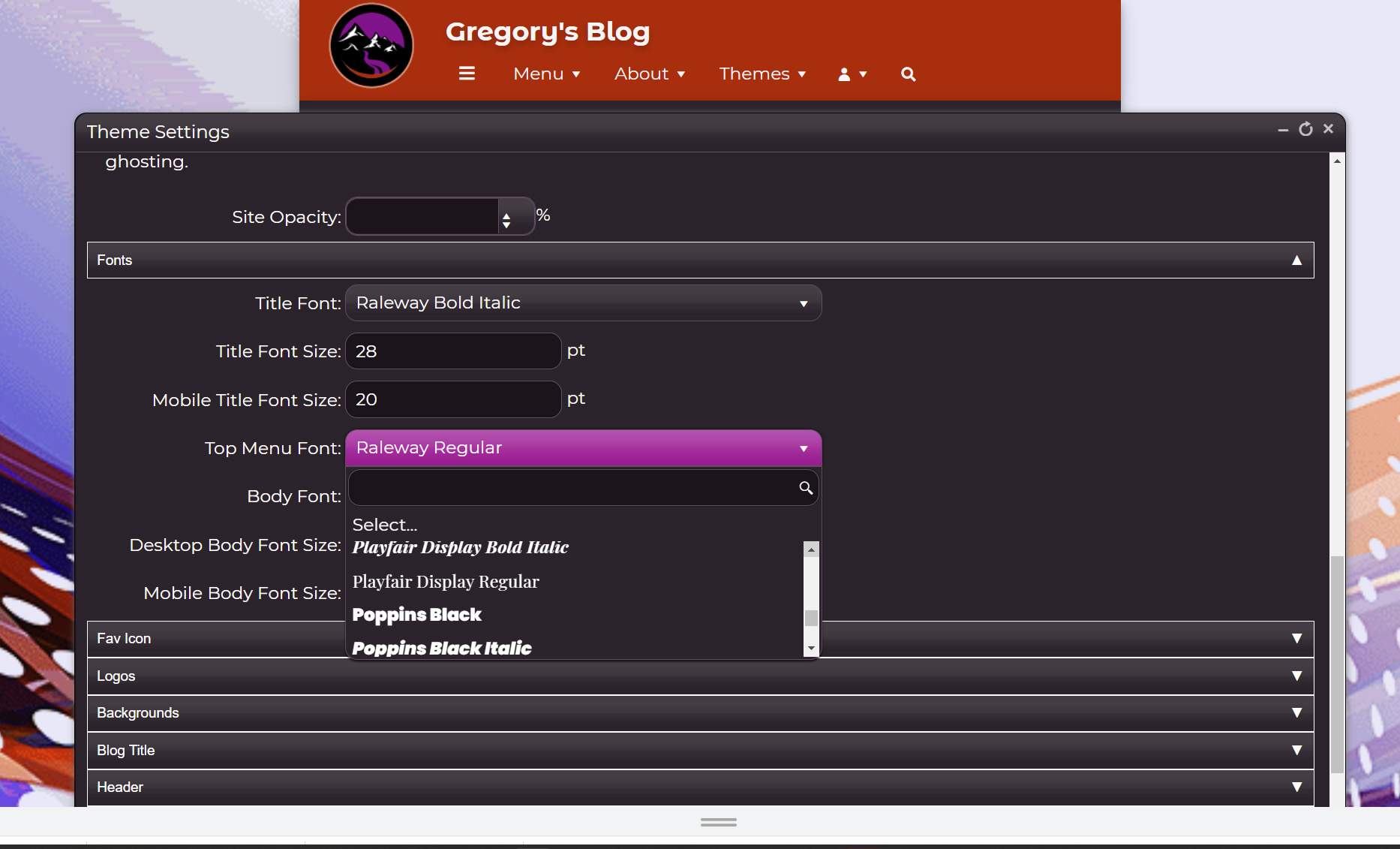
The following font choices are available in the theme interface:
- Title Font
The title font is the font of the blog title. My blog title is Gregory's Blog. - Title Font Size
Change the font size of the blog title. - Top Menu Font
Sets the menu font choice. In Galaxie Blog, the menu font contains Menu, About, and Themes. - Body Font
Sets the font for everything else. The body font should be easy to read. - Desktop Body Font Size
Sets the font size of the body on desktop devices. - Mobile Body Font Size
Sets the font size of the body on mobile devices.
Logos
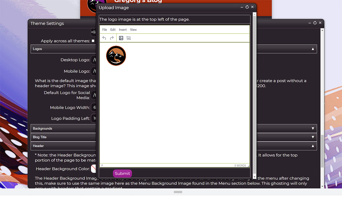
- Desktop Logo
The logo for desktop or large devices. Clicking on the Desktop logo form field will open up the tiny image uploader. You can use this uploader to upload and edit your logo image. My logos are 133 by 100 pixels.
- Mobile Logo
The logo for tablet and mobile devices. Clicking on this form field will also open up the tiny image uploader. You can use this uploader to upload and edit your logo image. My logos are 60 by 60 pixels. - Default Logo for Social Media
The default image that you want to share to social media sites when your post does not have an enclosure image. Clicking on this field will open the tiny image uploader. This image should be much larger than your site logo and is recommended to be 900x900 or 1200x1200. - Mobile Logo Width
Specify the width of the mobile logo. - Logo Padding Left
Used if you want to nudge the horizontal placement of the mobile logo. Enter a value in pixels.
Backgrounds
This section allows you to apply background images or colors to your theme.
- Include Background Images
Select yes If you want to apply a background image to your theme. You may not want a background image if you want a solid color or if you want the site to load quicker. - Blog Background Color
If you selected no above and don't want blog background images, you may select a hexadecimal blog background color using an HTML5 color picker.

- Desktop Background
Upload or edit the background for desktop devices. This image should be compressed. This image should be at least 1200x1200. Opens the tiny image uploader. - Mobile Blog Background
Other than the image size, same as above, but for mobile devices. My typical size for the images is 980x980. - Blog Background Position
The blog background position must contain CSS to position the background image on the page. This is useful if you want to nudge the image around the page. See https://www.w3schools.com/cssref/pr_background-position.asp or search for the background-position CSS property for more information. - Blog Background Image Repeat
The blog background image repeat must contain CSS to determine how a small background image will be repeated if can't fit the dimensions of the page. You can create interesting checkered tile designs that consume very little resources. See https://www.w3schools.com/cssref/pr_background-repeat.asp or search the web for the background-repeat CSS property. Unless you're after a tile-based design, it's suggested to leave this setting at 'no-repeat'.
Blog Title
Use this setting to apply a hexadecimal color to the blog title using an HTML5 color picker widget.
Header
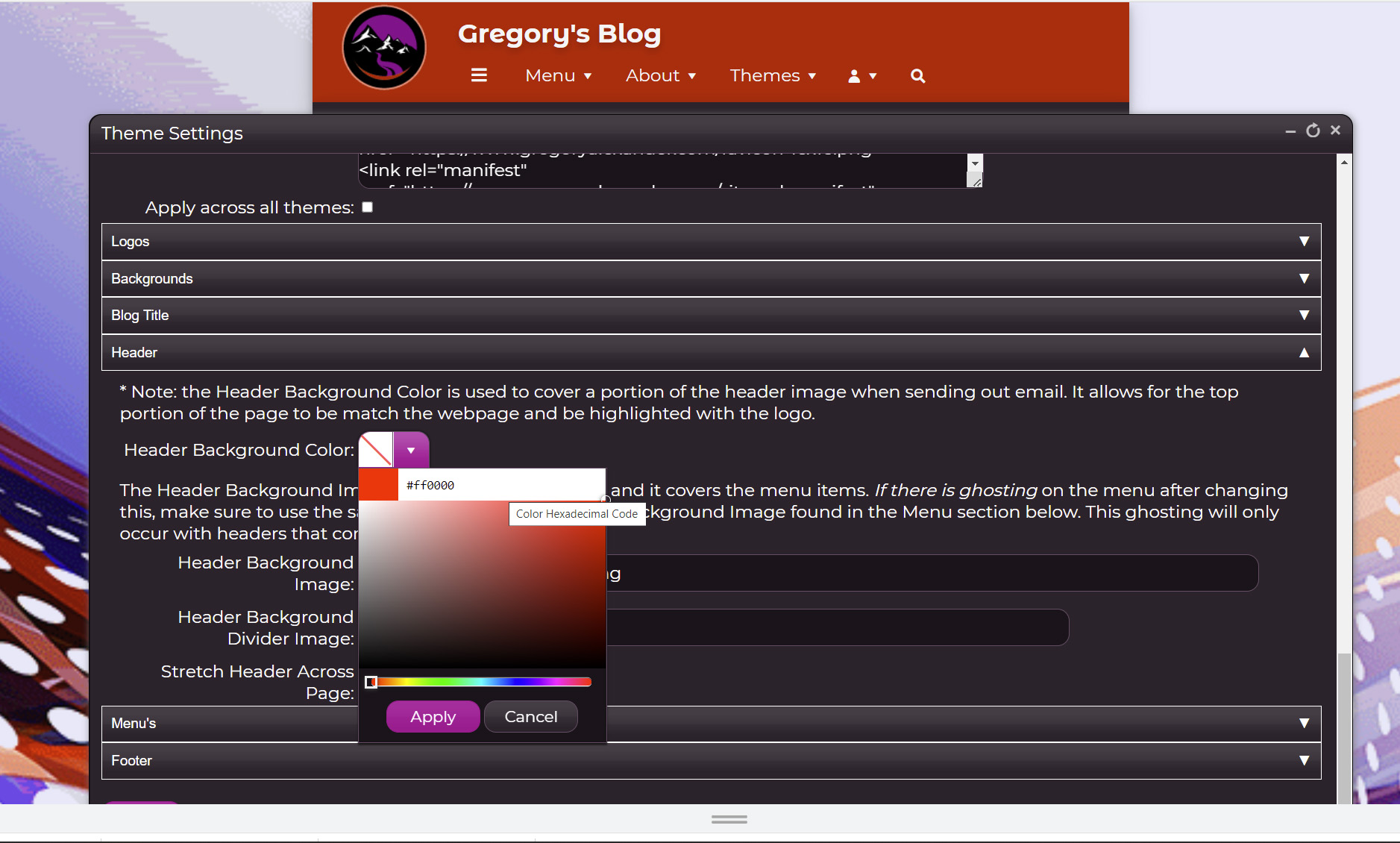
- Header Background Color
This is used when sending out branded emails. The Header Background Color covers a portion of the header image when sending an email. It allows the top portion of the page to match the webpage and be highlighted with the logo. If you're using a white background, you should leave this setting blank. It uses a color picker. - Header Background Image
Upload or edit the header background image using the Tiny Image Uploader.
The Header Background Image is at the top of the page and it covers the menu items. If there is ghosting on the menu after changing this, make sure to use the same image here as the Menu Background Image found in the Menu section below. This ghosting will only occur with gradient headers and should not be used when creating a flat theme. - Header Background Divider Image
This is used to create an interesting divider image that separates the header from the blog body. I do not use this image on any of my themes. Clicking on this field opens the Tiny Image Uploader. - Stretch Header Across Page
This checkbox should be checked if you want the header to take the entire width of the page.
Menu's
- Align Menu with Blog Content
When checked, this setting aligns the menu with the blog content. The default is yes. - Menu Background Image
The Menu Background Image is used to cover a portion of the header image when ghosting occurs after changing the Header Background Image. This is generally not used unless there is a gradient on the header. To remove the ghosting, it is advised to use the same image that you used for the menu background image. Clicking on this field opens the Tiny Image Uploader. - Cover Menu with Background Image
When checked, the background image will be shown behind the menu items. - Top Menu Align
Aligns the menu. Values are left, center, and right.
Footer
Allows you to upload or edit the image shown in the footer. Opens up the Tiny Image Uploader.
This entry was posted on May 29, 2022 at 7:22 PM and has received 767 views.